Göteborgsvarvet Part 1 - Introduction & General analysis

Oskar Handmark
Founder & Venture lead
Göteborgsvarvet is the largest half marathon in the world. In May, 2019 the race celebrated its 40 year anniversary, attracting over 50 000 runners and 200 000 spectators.
As a spectator you can follow a list of runners and see how they progress throughout the race. This is possible due to checkpoints along the track that runners pass every 5 kilometers. This is a fun way to keep track of your friends when you can’t see them. You will also see a projected finish time for your runners, which is based on their average pace so far.
It has always bothered me that finish time prediction is so basic and inaccurate. It disregards factors like the elevation curve of the race and the fact that most runners get tired as they get further into the race. It's also unable to estimate your finish time before you start the race.
We will fix this in this blog series, which is divided into three parts:
Part 1 - Data analysis (you are here) What can we learn by just looking at the data from different angles?
Part 2 - Hubris analysis What age and gender groups overestimate their abilities the most? This part also includes some feature engineering, which will come of great use in our predictive model covered in part 3.
Part 3 - Runner finish time prediction How well can we predict the runner’s finish time, before and during the race?
The race
Göteborgsvarvet is a half marathon around the central parts of Gothenburg. It has quite a challenging elevation curve compared to other half marathons in large cities. If we use elevation data from Google Maps, we can plot the race elevation. A drawback with the elevation data from Google is that it is purely based on the earth's surface, as seen below:
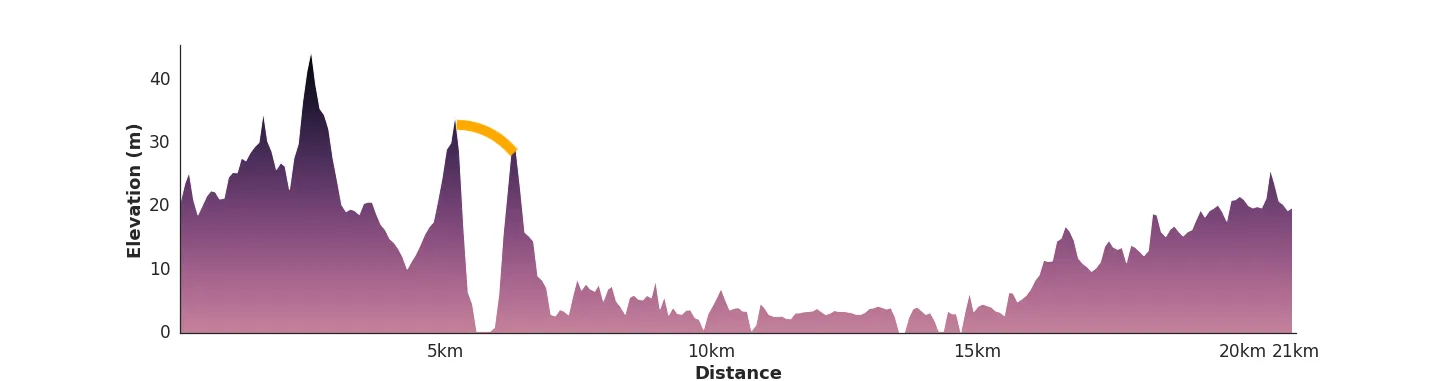 Yep, that's a bridge.
In our aid to answer the above questions, we have a tabular dataset consisting of ~39000 runners (one per row - only including runners that actually started). 35% of the runners are women (13600). It only includes data from 2019, which is a harsh limitation. If we had historical data for the past 20 years or so, we could do a whole lot more.
While there are a few runners from all over the world, most of them come from Sweden and central Europe:
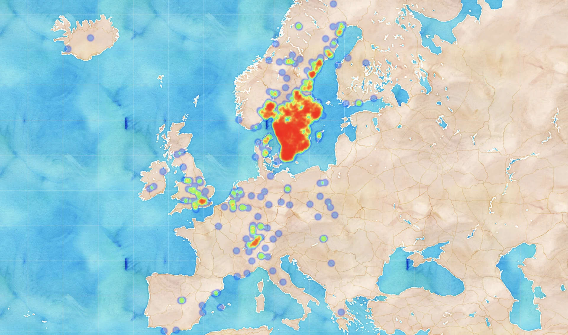 Heatmap over runner hometowns, latitude and longitude mapped to their represented city.
In addition to nationality and hometown (declared by every runner duringsignup), we have the following information:
General information:
Age
Gender
Start number
Start group
Company
Each runner’s checkpoint times at:
5 km
10 km
15 km
20 km
Finish (21km)
We will do a lot of different folds on this data to understand it. Visualizing the dataset gives us a good sense of the runner population - it will help us when we design features for the machine learning model in part 3.
Before we move on to gender, age and pace analysis, let's finish the geographical part by looking at top performing cities:
Best runners by city, for cities with at least 50 runners
 Average finish time for runners from cities that had at least 50 starting runners.
Cities outside of Sweden with few runners (less than 10) often had very good results. This can be explained by the fact that they travelled far to reach the race which probably means they are more committed runners, compared to the average Swedish runner. Oslo placing top for women, and second for men supports this theory.
Let's get to know our runners a bit better:
Finish time distribution by gender
 Finish time follows a normal distribution for both men and women.
Age distribution
 Women have increased interest for this race in ages 25-30, reduced interest in their thirties, and make a strong comeback in their early forties.
The age distribution is very interesting as neither curve (men or women) belongs to a normal distribution. One could probably write essays on why we see such a sudden decrease of runners in ages 30-40, but my simple guess is due to kids and family taking more time. It is also very relevant to point out that there are slightly more people in ages 25-29, than any other age (statistics from the Swedish Age Structure. We see a similar bimodal curve for men, with a smaller first peak compared to women.
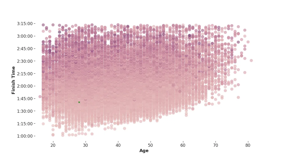
Because the age distribution does not follow a normal distribution, we can get further insights from our data by plotting the age distribution against finish time using kernel density estimates, to see where groups appear:
Finish time vs age density
 There are two different “typical runner” scenarios when looking at age versus finish times - the 30 year old that runs in a little under two hours, and the early forties person that runs in about the same time.
Let's plot the age versus finish time in a slightly different way to see if we can learn something more:
 Ridge plot with finish time by age group. At age group 48+ we can see a shift in finish times (the ridge moves with its density to the right).
We can observe the largest spread for young runners and old runners, and the mean finish time is around two hours. It is encouraging that runners in ages 32 - 48 aren’t significantly slower than younger runners. You will witness psychology at its finest if you look closely at the peaks for each age group around the two hour mark, in the above plot.
Let's look closer at the finish times around 2 hours.
Number of runners per finish time around 2:00:00
 Further investigation of major peaks in previous plot. 12 second bins. The two hour mark certainly motivates runners.
Plus/minus two minutes around the two hour mark, there seems to be a significant difference in the distributions. Using only data from 1:58:00 to 2:02:00, the percentage of runners that just made it is around **57%** (summing up each side and dividing the left side with the total - using buckets plus/minus two minutes around the center).
Using this measurement, let's look at which finish times this psychological effect is strongest. Instead of using a fixed 4 minute window, we will normalize the window size to the milestone time by using our 4 minute window for our two-hour milestone as a base (this works out to be about 3%).
Psychological effect at different finish times
 For each value on the x-axis, we measure the percentage of runners (y-value) that made it below that finish time, using a 3% window around the x-value.
We can see that the effect is strongest around 5 and 10 minute milestones. This is because people tend to set goals at even times, such as 2:00:00.
The trend in the plot is that success rate increase with finish time, meaning that the average percentage that made it increases slowly as we reach slower finish times. This makes perfect sense. If we were to draw a trend line, we would see it breaking 50% around 2:05:00 (which is also around the average time for all runners).
Another interesting observation is that there are seemingly random peaks between the milestones. For example, take a look at 2:07:00. These are an effect of unners setting pace goals instead of finish time goals. Running at a pace of exactly 6 minutes per kilometer the entire race nets you a total finish time of 2:06:35.
This plot doesn't mean that slower runners are better at beating their goals, or that fast runners don't care as much about their goals. Because finish times follow a normal distribution, there are naturally more people that finish at the slower side of the window (for finish times faster than the average). For example, following the normal distribution, it is more probable that you would find a runner between 1:35:00 and 1:36:00, than between 1:34:00 to 1:35:00. Similarly, it is more probable that you would find a runner between 2:44:00 and 2:45:00, than between 2:45:00 2:46:00. Keep this in mind as we look at the same plot, but grouped by women and men:
 For each value on the x-axis, we measure the percentage of runners (y-value) that made it below that finish time, using a 3% window around the x-value. The psychological effect is present for both genders, but it seems to be slight differences in which times are are important for men and women.
It is very hard to draw further conclusions from this plot. Since we can observe significant peaks for both women and men, the psychological effect is present for both genders. The peak at two hours isn't as high for women as for men, but this is probably because they follow different normal distributions, and women set other goals closer to their average finish time. For example, the effect seems to be similar around 2:40:00.
An idea is to normalize all data against their averages, to smooth out difference in absolute times between the genders - however this has the major drawback of losing the effect of the even milestone times, since all finish times would be slightly shifted.
We could be naive and say that men set more goals than women, or even that men are better at achieving their goals. However, it might just as well be that women set tougher goals, or don't set goals as much, or that men deliberately run slower to beat their goals - we don't know. We would have to consult other studies to find out more, and if there are differences in how men and women set, and achieve goals.
What we could do is go through the data, and find out if men and women tend to set finish time specific goals, or pace specific goals. When I did this I found no statistically significant difference.
Below is a similar plot, but shows the effect per age group, at 10 minute marks around 2 hours:
Psychological effect of 10 minute milestones for different age groups
 For different age groups and small windows around each milestone (3% of milestone time), what percentage of runners made it just below the time versus just above? Legend shows average finish time for each age group.
We can see that ages 16-24 have the highest success ratio around the 2 hour milestone, despite having a slower average finish time (02:04:17) than 3 of the other groups. However, when it comes to beating the 1:50:00 mark, age seems to matter - age group 56-64 completely dominates the younger runners at this milestone. We will get some ideas of what might cause this in part 2 of this blog post series.
We have looked at a few, but not all (start group, pace) properties of our runners. It has helped us understand them. But what makes a fast runner? What metrics differentiate fast runners from slow runners? What can we learn from just looking at the data of other people?
There are things you can, and cannot change about yourself - for example you cannot get younger, you cannot change gender (well...), and you cannot change your physical properties to be those of an Ethiopian.
So what can you change? Preparation is key, and a good tip is obviously to train more before the race, and work on your technique. If we draw conclusions by looking at averages from the Nordic population, you should move to Kullavik or Oslo. But moving to another city will not make you a faster runner, at least not immediately. Instead, we will look at the checkpoint data, and see if there is anything you can do about _the way that you pace yourself_ throughout the race. This will continue in part 2. Let me tease you with this plot.
Pace change - finish time vs age
 Standard deviation of run pace for the five different checkpoints computed individually for each runner. Darker means a more uneven pace. One circle per runner.
Published on November 11th 2019
Last updated on March 1st 2023, 11:03

Oskar Handmark
Founder & Venture lead